
Match the Wedding Palette
Begin with 2-4 main colors and repeat them with intention across suits, bridesmaid dresses, florals, decor, and small finishing details.
WEDDING
Coordinate suits, dresses, accessories, and wedding colors with confidence.
Overview
Color coordination helps the wedding party look intentional while giving each role room to feel natural. This guide shows how to connect suits, bridesmaid dresses, ties, pocket squares, bouquets, and accessories through a balanced wedding palette.
Principles
Choose the main colors first so every suit, dress, floral, and accessory has a clear direction.
Let the wedding party feel connected without making every piece the exact same shade.
Ties, pocket squares, socks, boutonnieres, and bouquets can carry color across the full party.
Main Guide
Start broad, then refine the details so the wedding party looks connected from ceremony photos to reception lighting.
Begin with 2-4 main colors and repeat them with intention across suits, bridesmaid dresses, florals, decor, and small finishing details.
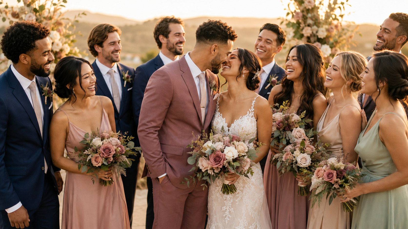
Groomsmen suits should complement the bridesmaid dresses instead of matching them exactly. Navy with blush, charcoal with sage, and black with champagne all feel polished without looking forced.
Ties, pocket squares, socks, boutonnieres, and bouquets are the easiest way to connect separate colors while keeping the suit base refined.
Strong tones like burgundy, emerald, navy, black, and rose look best when they are grounded with neutrals such as ivory, champagne, charcoal, cream, or tan.
Light colors suit spring, summer, daytime, and outdoor weddings. Deeper tones work beautifully for evening celebrations, fall or winter dates, and formal venues.
Pairing Ideas
Coordination Steps
Choose the main wedding color palette.
Select suit or tuxedo colors.
Match bridesmaid dresses with complementary tones.
Add ties, pocket squares, and boutonnieres.
Review the full wedding party look together.
Ask for styling help if unsure.
Styling Support
Our styling team can help coordinate suits, dresses, accessories, and wedding colors into one polished look.
FAQ